It may be playing catch-up, but Pinterest is finally making its platform more accessible to people who are blind or have low vision.
On Wednesday, Pinterest announced a handful of updates across the company’s app and website, particularly aimed at being more inclusive.
Steered by lead designer Long Cheng, Pinterest partnered with San Francisco non-profit Lighthouse for the Blind and Visually Impaired to develop the updates.
“After talking to Pinners and finding out how Pinterest was (and wasn’t) working for them, we did an accessibility audit and created a list of areas to improve,” says Pinterest’s press statement.
According to Co.Design, Cheng sat down with a range of people who are blind, or have low or limited vision to play with the app. He found many had trouble using the platform, navigating between pins, and even simply creating accounts.
Accessibility features are already built into iOS (VoiceOver) and Android (TalkBack), which allow users to get spoken feedback from devices without looking at the screen. Users can hear a description of everything that’s happening on the screen using the features, from caller ID to your battery level.
But according to Co.Design, Pinterest hadn’t properly managed its metadata to allow its UI to work with these features. The publisher noted, for example, that pinned recipes spoken by the feature were missing ingredients.
So, what has Pinterest actually done to make the platform more accessible?
Improved color contrast sensitivity
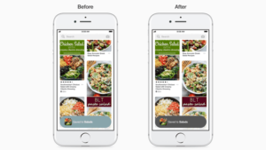
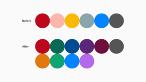
Although decreased color perception can accompany low vision, color can still be used to enhance important features and increase accessibility within platforms. The color palette of Pinterest has become more readable for people with sensitivity to bright colors, and people who have low vision. Plus, text is easier to read against backgrounds of certain colors. Check out the new palette:

Screen reader support
People who are blind or have low vision will be able to receive spoken feedback from Pinterest. That means the integration into iOS’ VoiceOver and Android’s TalkBack will actually work, and will make signing up, browsing, and saving pins easier.
Bolder type and customisable text size
Pinterest has enabled support for dynamic font sizes that you can adjust to your preference, and it’s rolling out more meaningful bolding of type, to make first glance information more legible.
Clearer focus indicators
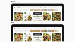
People with low vision that navigate Pinterest with a keyboard instead of a mouse or trackpad will be able to more easily see which part of the site they’re currently focused on.

Accessibility best practices for engineers and developers
Pinterest has made accessibility a company priority for engineers and developers, and has created a new UI library with accessible components. They’ve also implemented accessibility checks, which will be applied to all new features rolling out in the future.
So, when is this all rolling out? Pinterest says it’s made “significant progress” updating the iOS and web versions of the platform, and that it’s “working on bringing these changes to Android soon.”


