More Android users should have access to the new interface as well.
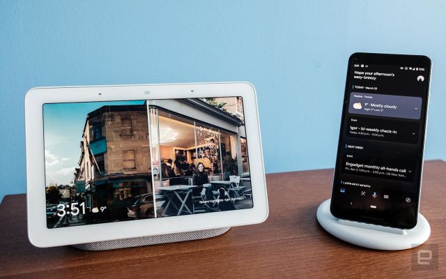
Over the last few weeks, Google has been slowly rolling out a redesigned “Snapshot” feed to Assistant on Android devices that makes the updates portion of the app more visual. As of today, it’s also available on iOS.
You can check out the new experience by launching Assistant and then tapping on the inbox icon located near the bottom left of the interface. You’ll then see the redesigned feed, which organizes a variety of information using chronological cards.
You can tap on the cards to expand them and see additional information. Expanding the weather widget, for instance, will display a five-day forecast, with additional prompts to save you the trouble of asking Assistant a question with your voice. Expanding a calendar reminder, meanwhile, allows you to see the description of an upcoming event and a list of attendees. There’s also a shortcut that takes you directly to the invite in Google Calendar.
The new experience also integrates with Google Podcasts. If you pause an episode, you can resume it directly from the top of the screen. At the bottom of the interface, there’s an “Other Important Things” heading, under which you can do stuff like quickly put together a shopping list. Assistant will also highlight things you can in the surrounding area using Maps.
If you weren’t a consistent Assistant user already, the new Snapshot interface likely won’t change your mind on Google’s digital helper. But for those of us who already depend on the AI, the redesigned feed is a nice tweak.


