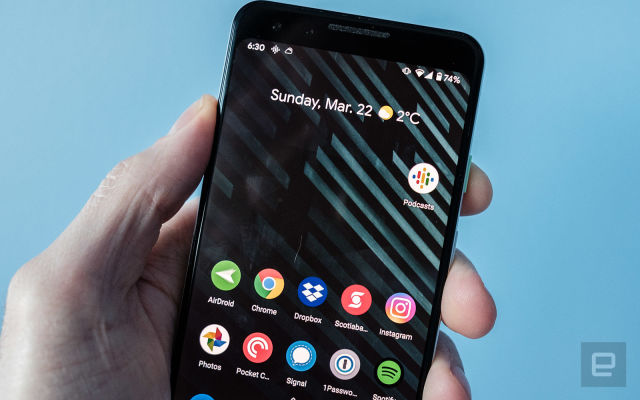
The app is currently available to some beta channel users.
According to 9to5Google, Google has started rolling out a redesigned Podcasts app to some Android users. Thankfully, it appears to address at least some of the issues people have with the company’s current offering.
The main draw is a new three-tab interface that does a lot to declutter the current experience. Instead of emphasizing discoverability, the main “Home” tab now focuses on your current favorites. New icons allow you to download and queue episodes without tapping into a specific episode. In a way, this part of the interface is reminiscent of the tweaks Spotify made to its podcasts section. Elsewhere, the Home tab takes a different approach to how it goes about letting you know when you have new episodes to listen to; there’s now a circular red icon at the top right corner of a podcast’s cover art that’s hard to miss.
The update also appears to have enabled auto-downloading for some people, allowing them to configure the app to fetch the latest episodes of their favorite shows automatically. According to 9to5, this is a feature Google has been slowly turning on for some Podcasts users since this past May, but it now looks like it may be rolling out more broadly. Another new feature allows you to set individual notifications for shows so that you can know the moment there’s a new episode to check out.
For most of Android’s history, Google has treated podcasts as an afterthought. Even when you factor in this upcoming update, there are still a lot of features the company could add to make Podcasts more competitive with apps like Overcast and Spotify. Still, this is a step in the right direction.


