Last night’s Samsung Unpacked was a masterclass in showing your good side.
Take a look at the Galaxy Fold’s 68 official images on Samsung’s press site, and see if you can work out what’s missing. Or watch the promotional clip and tell me what you find odd about it. No, I’m not talking about how weird that tiny outside screen is. Instead, it’s the thing Samsung went to painstaking lengths to avoid talking about at is “Unpacked” keynote yesterday. It’s an issue facing all folding phones, really: the fold gap.
Samsung Galaxy Fold
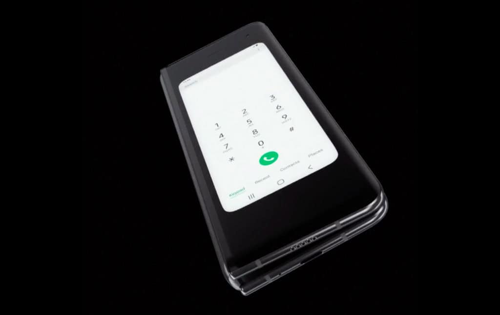
This is the Galaxy Fold… folded. Just look at the outline of the device. The image comes from the reveal video, which is the single piece of media that shows this angle. (Even then, it’s only for two seconds.) In it, you can see a clear, and frankly glaring, gap between the two parts of the phone where it hinges.
The gap appears to be a hair wider than the two “phone” parts are thick — perhaps it’s about 10mm — which might not sound a lot, but it makes the Fold an even stranger device than it first appears.
For years people joked about every new phone just being “a black rectangle.” Here, Samsung has made a black triangle. Okay, a triangular prism. And those sides aren’t very black. The point is: This thing doesn’t fold flat.
A $2,000 phone with a huge gap in the middle doesn’t sound like the best idea, and it’s certainly not attractive, but my issue is more with the ergonomics. Eyeballing it, it seems like the two phone parts sit at around an 85-degree angle from the hinge. That means the screen side is going to sit around 10 degrees away from “flat” when laid down on a surface, folded.
You’ll adjust to this odd angle, of course. Maybe your grip will change or your hand will tilt, without you even thinking about it, to ensure you’re looking at a flat display. But there would be no getting away from it. Imagine your shiny new phone on your desk, for example, the face angled awkwardly away from the flat surface. If you have two phones around, you can get a rough idea what this would be like by just balancing one on the edge of the other. Frankly, it sucks. Again, the Galaxy Fold will cost $2,000.
There’s a practical reason for the off-kilter design. “Foldable” displays, for all their engineering, still behave quite similarly to paper. If you fold a sheet of paper over on itself, you’re left with a loop that you have to push down on to form a crease.
The problem is, Samsung can’t have its display crease. There’s the obvious aesthetic downside: It wouldn’t be great to have a crease down the middle of that gorgeous 7.3-inch display when opened. But the more important challenge facing Samsung is that mechanically, at least from every demonstration of the tech I’ve seen, a crease would destroy the display. Right now these displays are still more “bendable” than “foldable.”
All that said, I’m very impressed by the Fold’s hinge — it looks durable, attractive and is certainly the best solution to this problem that we’ve seen. But despite its good work, Samsung hasn’t been able to engineer around the basic shortfalls of the display tech.
If you want a phone that opens similarly to the Fold, but without that gap, there are a couple of solutions. Samsung’s designers could implement a deeper hinge that can house the bend without creasing it; until I saw the gap, that’s what I thought they had done. Or, they could wait for displays to advance to the point where they can get something very close to a flat fold. In reality, future devices will probably utilize a mix of both of those to produce the device Samsung, with some expertly curated demos, basically pretended it had built yesterday.
As is, what we have is a device whose main selling point is also its main limitation. A smartphone that’s as expensive as a laptop — or buying high-end phone and a tablet. Hopefully, the Galaxy Fold will spark creativity in hardware designers and lead to someone perfecting this idea in the future. But at this early stage, I’m not buying it.


